
Stand out in the AI ecosystem
MilaStand out in the AI ecosystem
- Positioning
- Brand Strategy
- Brand Architecture
- Visual Identity
The challenge
Given AI’s growing importance and the rising interest people from all social spheres are giving the matter, Mila felt it necessary to reflect upon how it could breathe new life into its brand platform, while keeping the assets of its visual identity. The intent was to make this platform more relevant by bringing the institute’s pillars, roles and challenges to the forefront, all the while supporting its growth by meeting its aspirations and ambitions head-on.
Our perspective
Using the BrandBourg method, we facilitated workshops with various stakeholders from Mila (members of the communications, leadership and partnerships teams as well as students, professors and researchers) to identify the strengths characteristic of each of the institute’s areas of expertise and thus define its strategic axes and personality.
These workshops allowed us to determine the parameters that would serve to improve and optimize the existing brand expression platform while maintaining its key identifiers – the colour purple and the logo (which was resized).
Our process led to a meaningful, unifying brand story that rallied all the stakeholders around a common message.
The solution
Together, we developed a distinctly original platform that would allow Mila to stand out in the AI ecosystem. It’s a contemporary, human-centred, flexible approach that takes into account the foundations and values of the organization – and one that is fully able to uphold it brilliantly in all that’s to come.
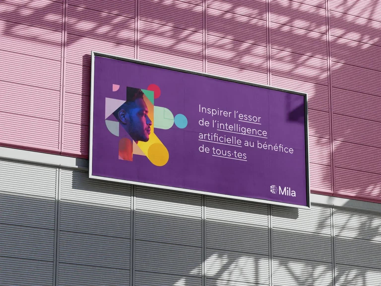
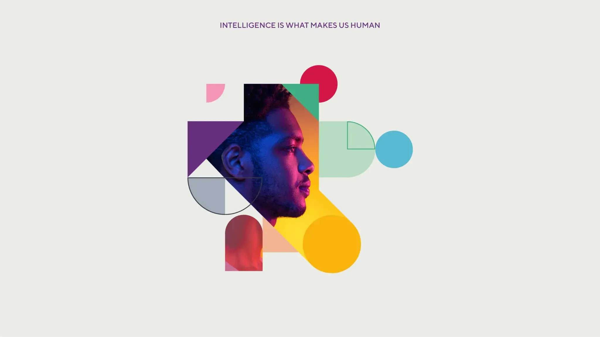
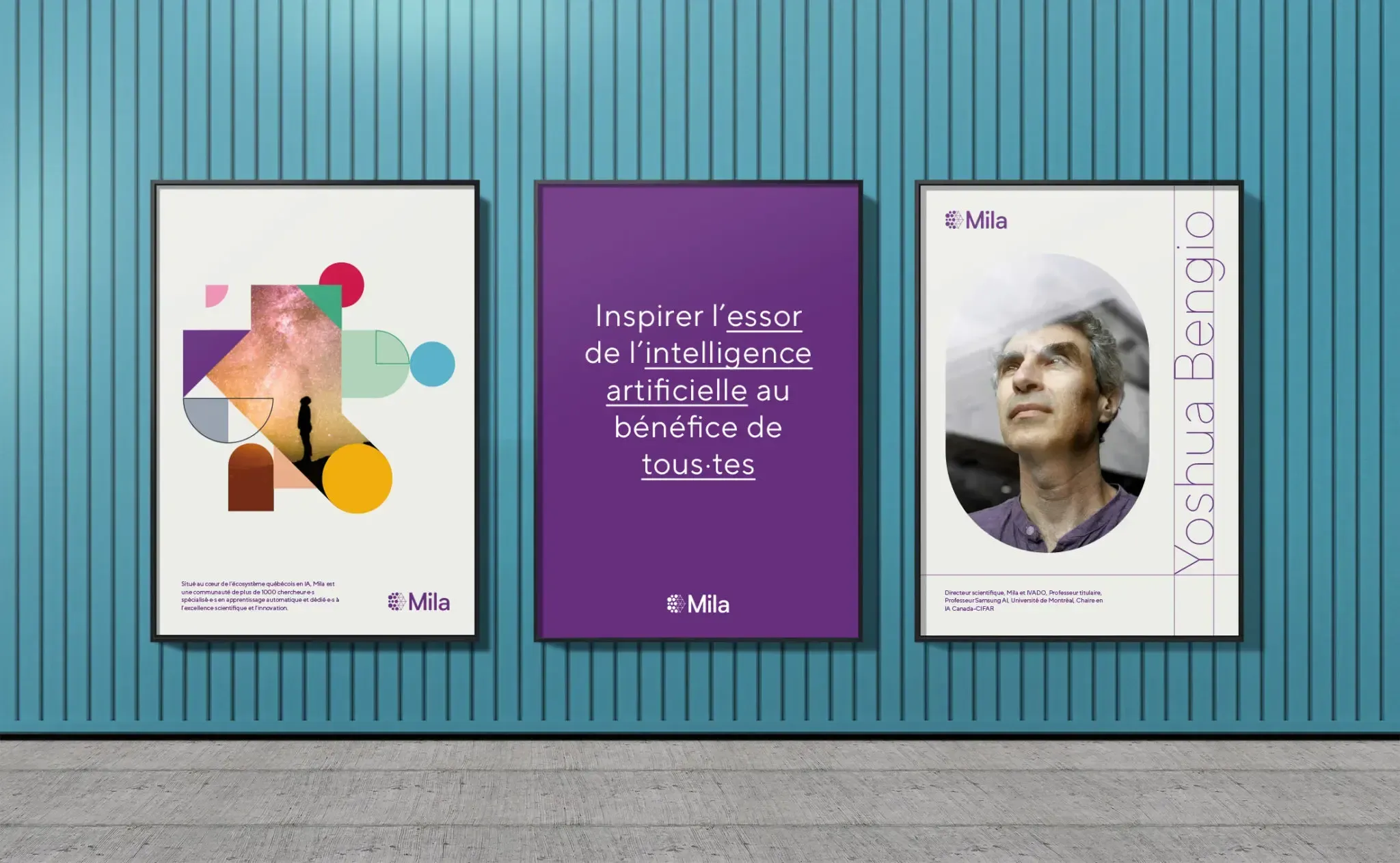
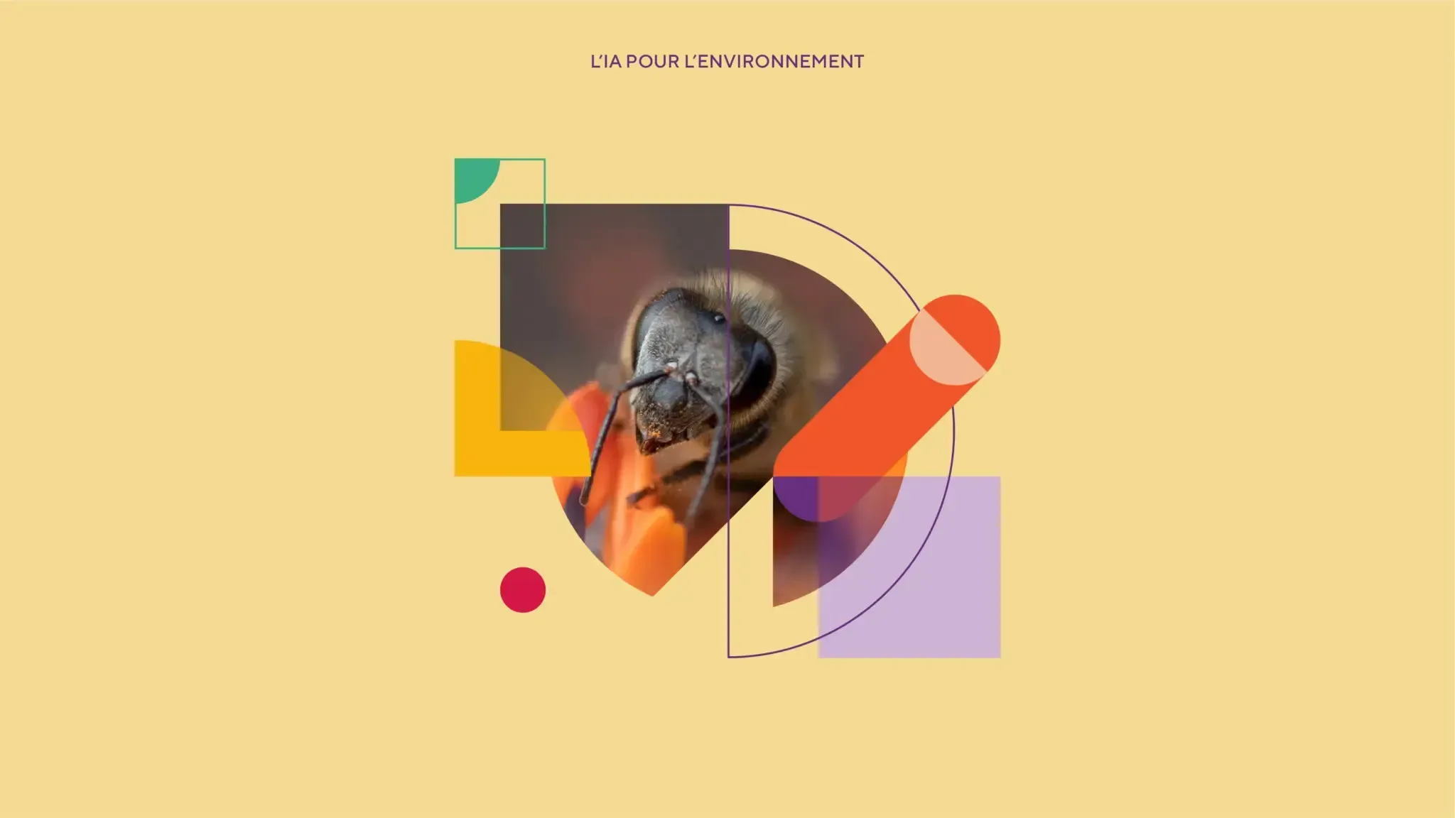
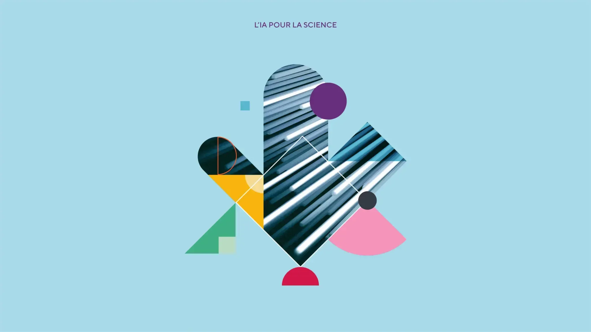
The mosaic is at the heart of this new visual expression. It represents both the complexity of AI and the variety of issues it aims to tackle. At the same time, it stands for harmony, denoting all the solutions that AI offers for humanity. Designed using basic geometric shapes such as circles, squares, triangles and quarter circles, it’s a nod to the basics of learning, to children’s building blocks that foster creativity, invention and transformation, and it can symbolize a concrete idea as much as a more ambiguous topic of research. Above all, the mosaic is a strong symbol for the harmonious vision of AI and humans together.
The colour palette, made up of tones and half-tones, is bold, dynamic and surprising – it’s vital to the brand expression and brand recognition. As a whole, the colour palette duly expresses the diversity and infinite possibility of AI while accentuating the exceptional character of the institute, its values and its mission.
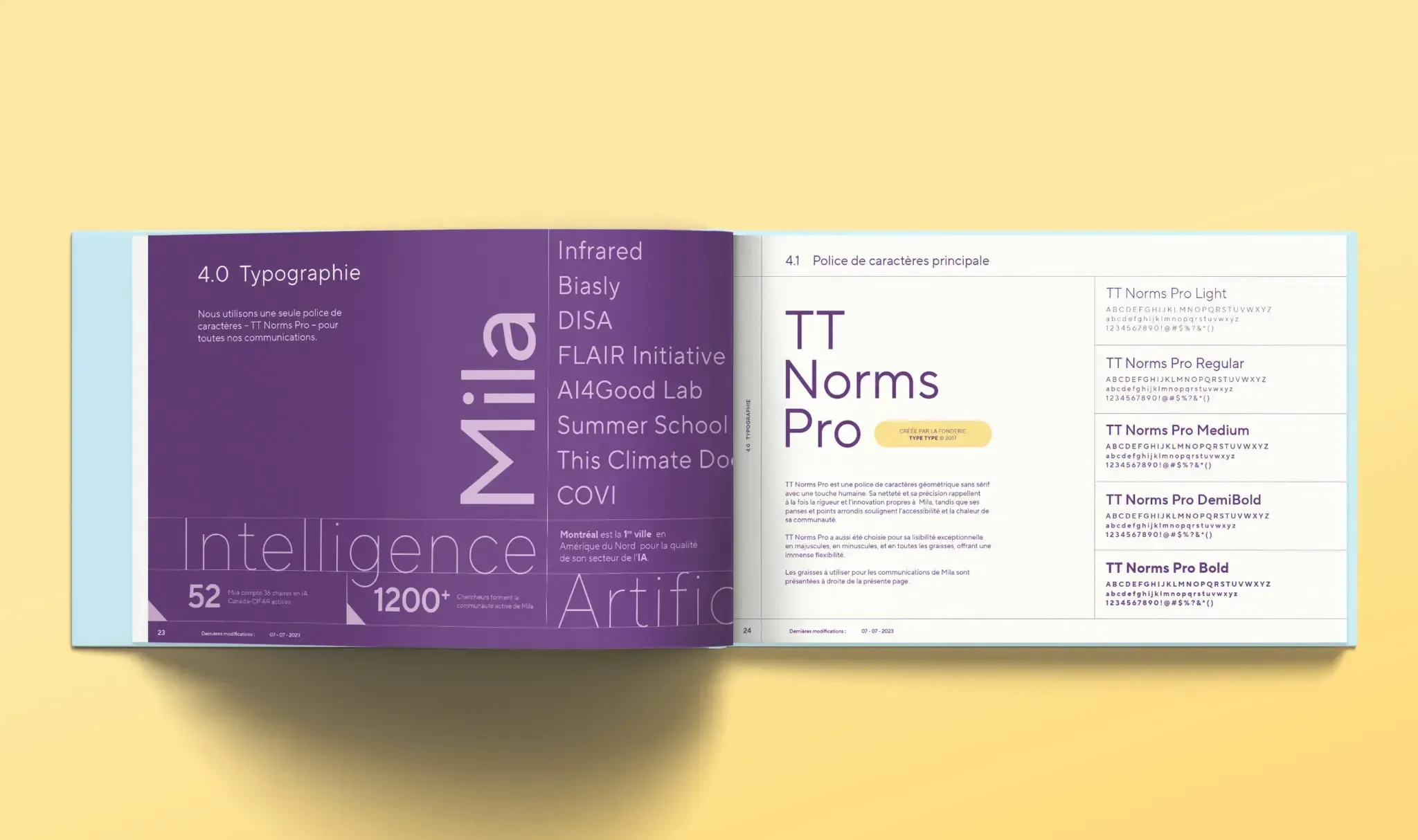
Sans serif lettering was chosen to accompany the geometric shapes. The clean, precise lines are a nod to the rigorous procedure and innovation that Mila is known for, while the soft curves of the lettering further serve to highlight the humanity, accessibility and warmth of this great community.
With its brand platform solidly in place, Mila now has all it needs to take up its position as a worldwide leader in the vast, complex world of artificial intelligence.
We are thrilled to be working with the BrandBourg team to support us in the development of Mila’s brand. Their understanding of our reality and challenges, as well as their collaborative approach, has won us over.

Your brand deserves better. Let’s talk.
Your brand deserves better. Let’s talk.